Developing the online sales platform for a rapidly growing accessories brand.
Molequin
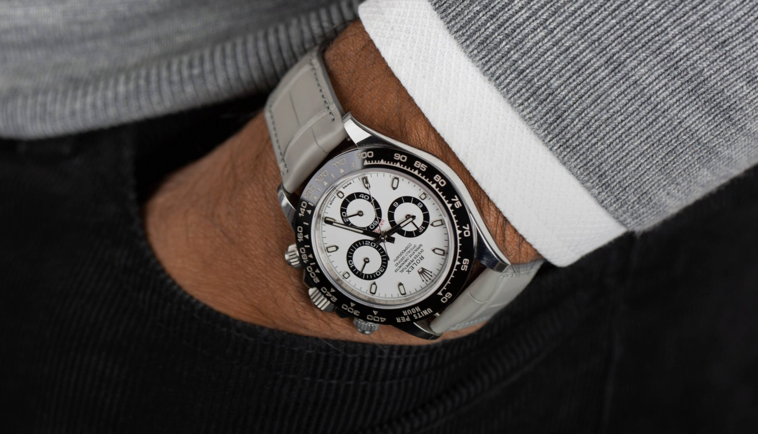
Molequin is a high-end watch strap and leather accessories brand created in 2016 by two enthusiasts. All of its products are developed in Belgium and manufactured in France, within a partner workshop.
From its inception, the brand defined three key principles that it still follows today:
- Use ethical leather sourced exclusively from French farms.
- Offer products that meet the highest quality standards.
- Adopt a sustainable style that goes against ephemeral trends.
This philosophy, coupled with the quality of its products, has allowed Molequin to experience sustained growth since its creation. To such an extent that its online sales platform quickly reached its limits, both from a technical and organizational point of view.
In this context, Caracal intervened to develop a new, more efficient sales platform and to support Molequin on 2 levels:
- Web design
- E-Commerce
Challenges
Molequin’s challenge was to build an online store that offers a user experience commensurate with its customers’ expectations.
Indeed, the shopping experience had to be as good as the product itself. This involves designing a clear interface, a smooth site, well-organized product sheets, and a hassle-free payment process. Furthermore, beyond user experience, the new online store had to be robust enough to keep up with Molequin’s sustained growth.


Methodology
To meet this challenge, our team followed two key steps.
Firstly, we took the time to understand the brand, study its products, its market, and the philosophy of its founders. This analytical work was necessary to define Molequin’s visual identity, which would be applied to the new online store.
Secondly, we compiled all the best E-Commerce practices to design an online store that:
- Offers an excellent user experience,
- Optimizes its conversion rate,
- Can grow steadily without technical concerns.
This preparatory work, carried out in two stages, allowed us to deploy our solution to help Molequin continue its growth.
Solutions
We began by developing the brand’s visual identity for web usage on two levels:
- Its colors.
- Its typography.
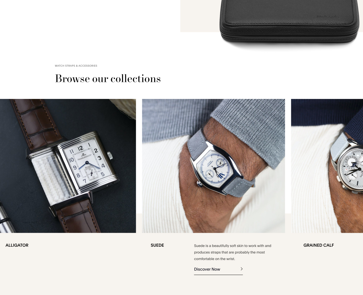
The chosen colors include navy blue, white, gray, and beige. As for the fonts, they use Serif for titles and Sans Serif for all texts.
Our goal was to achieve a streamlined visual identity, matching the brand’s philosophy and its two founders.
Once the visual identity was defined, we developed Molequin’s new online store by designing it and integrating it with WooCommerce.
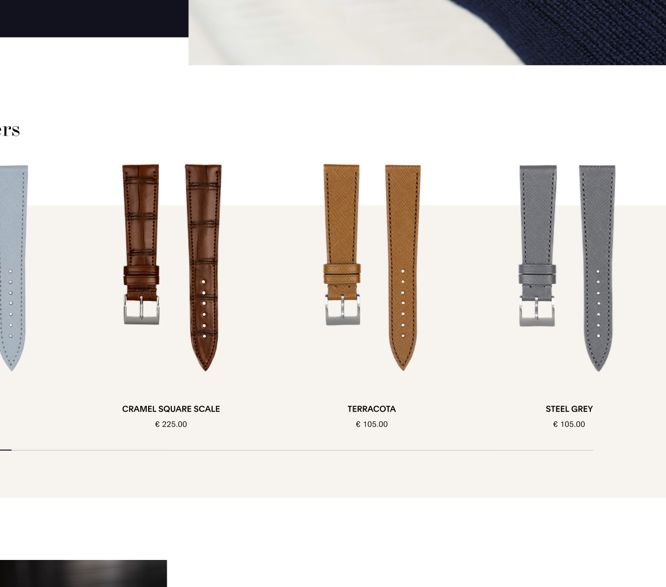
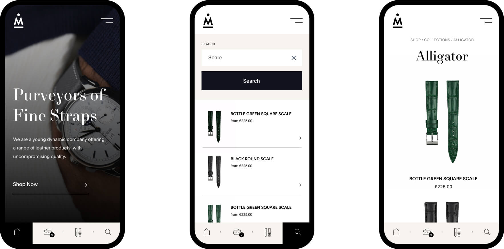
Today, this online store offers excellent navigation thanks to an intuitive user interface incorporating several elements, notably:
- Clearly determined product categories (Nubuck, Suede, Saffiano, etc.)
- Filters that allow users to find what they’re looking for based on various criteria (Price, new items, colors, type of leather, size, desired strap length, etc.)
Moreover, Molequin accepts multiple payment methods to facilitate transactions on its online store and streamline its user experience.

Impact
The impact of our support manifested in various ways.
First, Molequin was able to position itself in the market by showcasing a new visual identity, thanks to the colors and typography we defined.
Next, the brand was able to grow steadily with an online store capable of keeping up with its growth pace. Molequin freed itself from a constraint by benefiting from efficient E-Commerce, whether from a technical or user experience standpoint.
Lastly, Molequin now has a better brand image, thanks to its identity and sales platform, allowing it to increase its results.
By making this investment, Molequin’s founders have unlocked a constraint that was holding back their brand’s growth and can now reap the rewards. Investing in your image and sales channels can be very profitable, provided you are guided by the right team.
