A new graphic charter and a new website to democratize AI
Fari
GPT-4, ChatGPT, DALL-E, Midjourney… Artificial Intelligence (AI) is developing increasingly rapidly and will drastically impact our lives and the way we work.
Between excitement and fear, AI leaves no one indifferent. Even though we are only at the beginning, many more changes are yet to come, and it is essential to prepare for them.
This is why FARI was created.
FARI is an independent, non-profit initiative, led by VUB (Vrije Universiteit Brussel), ULB (Université Libre de Bruxelles), the Brussels Region, and funded by the European Union.
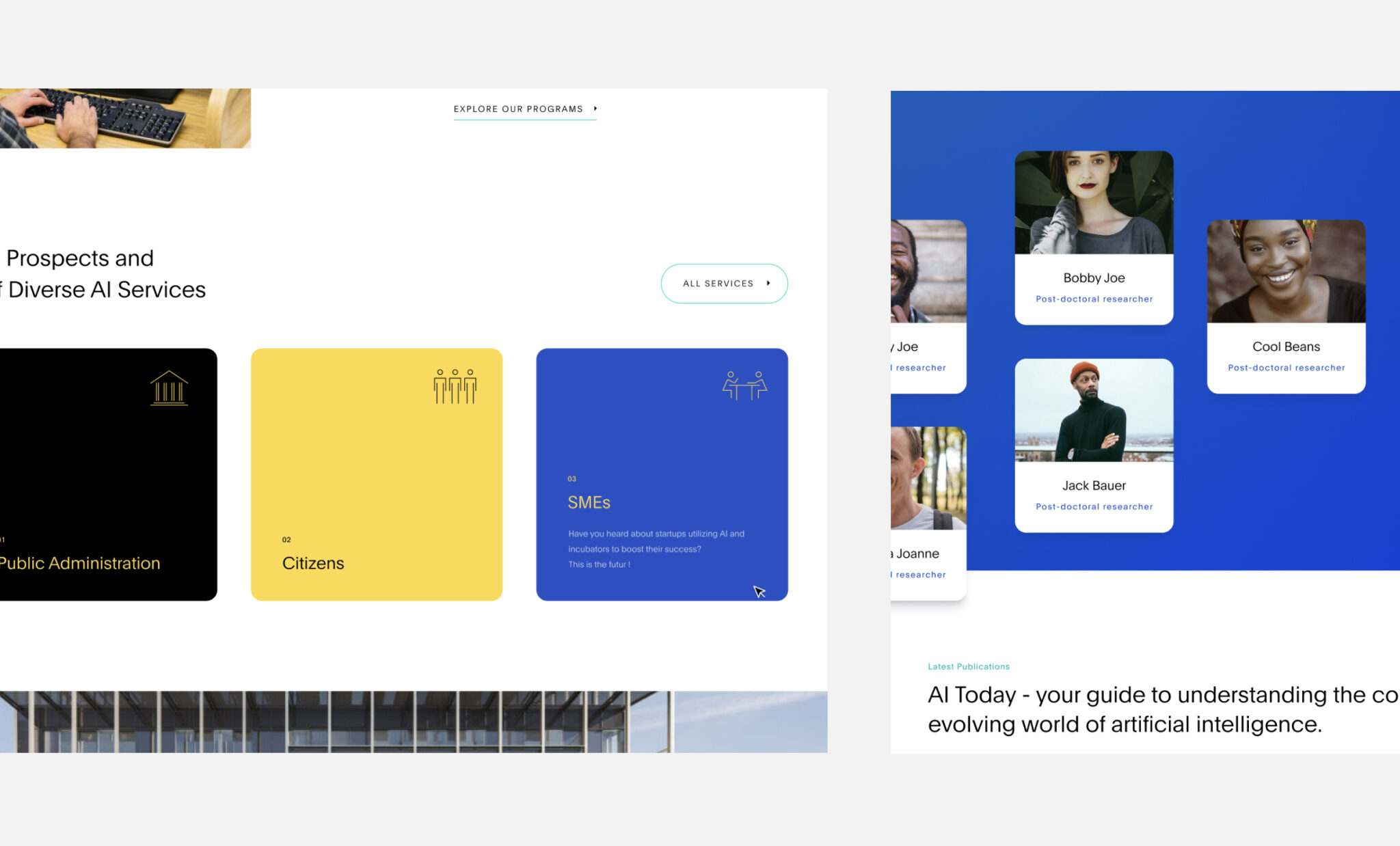
To achieve this, FARI mainly targets citizens, public administrations, and SMEs by: Organizing events and conferences, offering training, conducting research projects. We had the opportunity to support FARI in various ways to help them fulfill their mission.
Challenges
The challenge posed by FARI is directly linked to its mission. Due to its technical nature, the diversity of its targets, and its different offerings.
Indeed, FARI tackles a technical subject (artificial intelligence) by aiming at various targets (citizens, public administrations, and SMEs) while providing several types of services (events, training, research projects).
The scope is therefore vast, and the challenge for FARI is to communicate effectively about its mission through a communication channel that can address each of its targets.
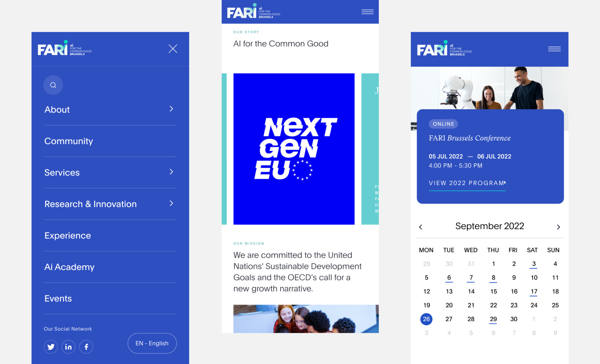
This is precisely where we intervened, developing a new digital graphic charter and a new website to help FARI achieve its goals more easily.

Methodology
First,
We analyzed the site that FARI was using to understand its flaws and list the essential elements to be added to the website we were going to develop.
FARI had a single-page site that needed a complete overhaul and a more modern design.
Then,
We sought inspiration from other scientific websites. The goal was to understand the sector’s conventions to include them in our creative process. Indeed, a magazine’s website won’t use the same conventions as a real estate agency’s, which in turn won’t follow the same guidelines as a site like FARI’s. You can see for yourself by reviewing our work: L’Éventail / Inside Properties / FARI
Finally,
Based on this analysis and benchmark, we identified our focus areas.

Solutions
We developed our solution for FARI in two stages.
First, we redefined their visual identity by creating a brand new digital graphic charter, consisting of: A color palette, Icons, Typography.
We ensured the palette included primary colors, accompanied by secondary colors, with each one associated with a specific aspect of FARI: Blue refers to training, Yellow to services, Light blue to research, Pink to the experimentation center.
Secondly, once the new graphic charter was approved, we developed FARI’s new website. We transitioned from a single-page site to one with multiple categories, each containing several pages.
The goal was to present the information more effectively by restructuring the website while offering a better user experience. Naturally, we developed this new website using the previously created graphic charter.
Impact
The impact of our support manifested in various ways for FARI.
Firstly, the new graphic charter and website significantly strengthened their brand image.
Then, FARI can now present its messages far more convincingly than before. This is crucial, given the topic they address and their ambition to democratize it.
Consequently, this allows FARI to attract more participants to its events, train more individuals, convince administrations more easily, and thus achieve its mission of democratizing artificial intelligence.
It represents your brand and defines the first impression you leave with your stakeholders. So, it’s vital not to overlook: Its structure, Its appearance and graphic charter, Its organic searchranking, Etc.
Indeed, it is an investment to consider, but you will undoubtedly recoup it by achieving your goals more quickly. FARI understands this and now has a much more significant impact than before.
