
Managing the graphic redesign of a major public institution
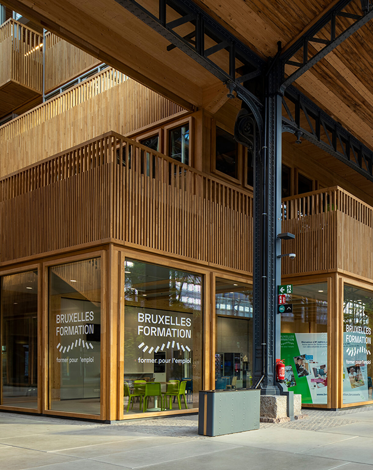
Bruxelles Formation
Business needs are constantly evolving. To stay relevant in the job market, workers need to update their skills with the right training.
Providing such trainings, and allowing people to find a job, is the mission tackled by Bruxelles Formation.
Bruxelles Formation is the French-speaking public institution in charge of professional training in the Brussels Region. Together with their network of partners, they offer over 600 training courses a year for job seekers.
And the results are quite convincing! According to a study led by Actiris, chances of finding a job go from 54% to 71% after following a training. So the impact is real and it makes a difference to job seekers.
However, to increase its impact, Bruxelles Formation needs to improve its cross-channel communication with jobseekers and employers.
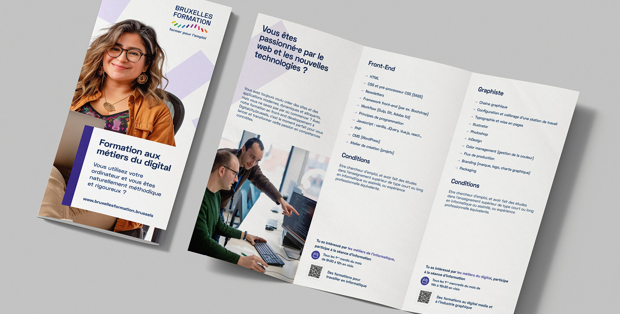
That’s why Bruxelles Formation chose Caracal, in collaboration with Shake, to conduct a graphic redesign of their communication (including colors, illustrations, and documents layout) as well as to manage all their prepress operations.
Challenges
On the one hand, the project involved a light brand redesign. The main challenge of a redesign is to create something new from something that already exists. Unlike a complete rebrand, where we can start from a blank page, a graphic redesign requires us to innovate with the old.
On the other hand, prepress (which includes both layout and assembly of graphic documents before they are printed) presents two different challenges:
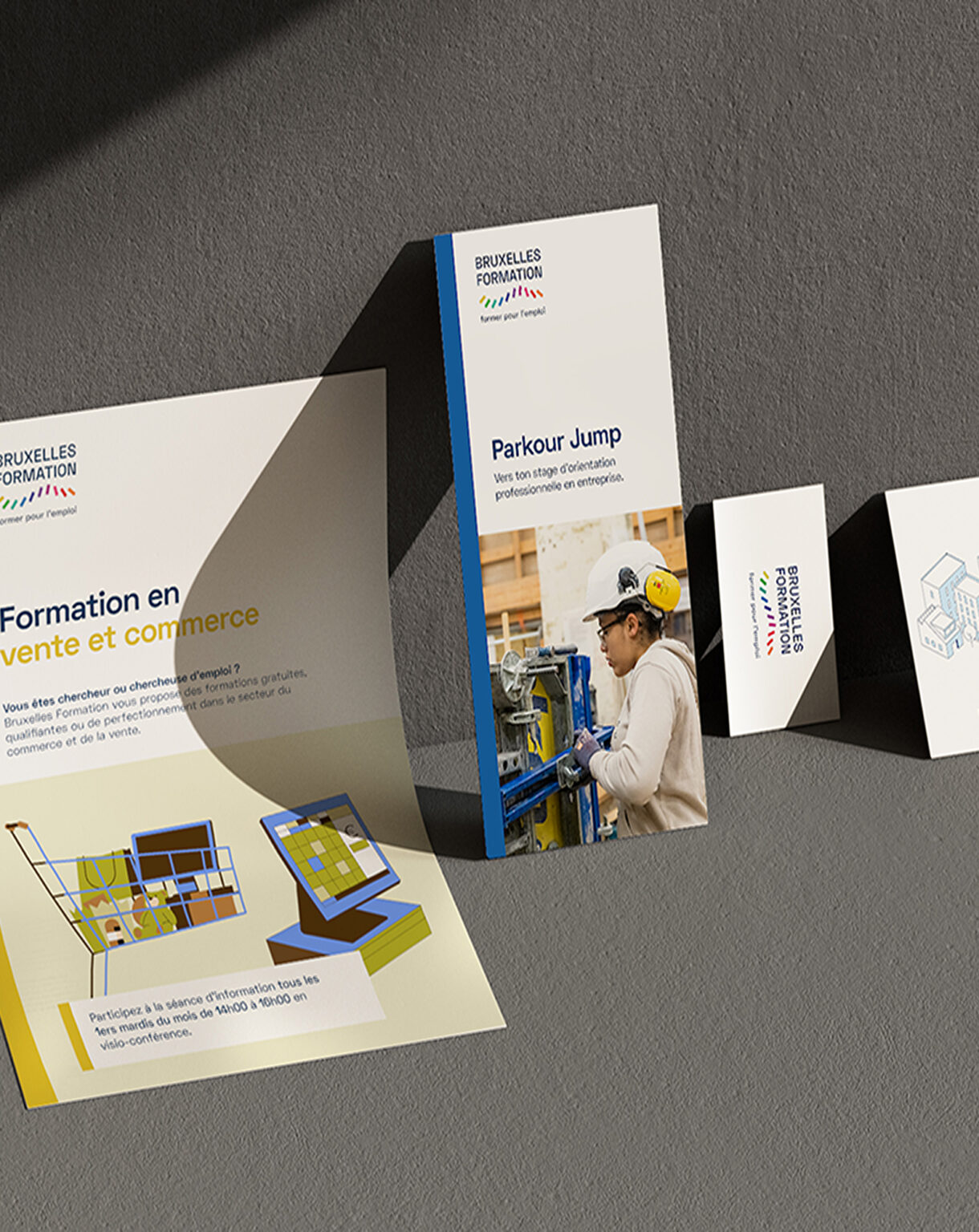
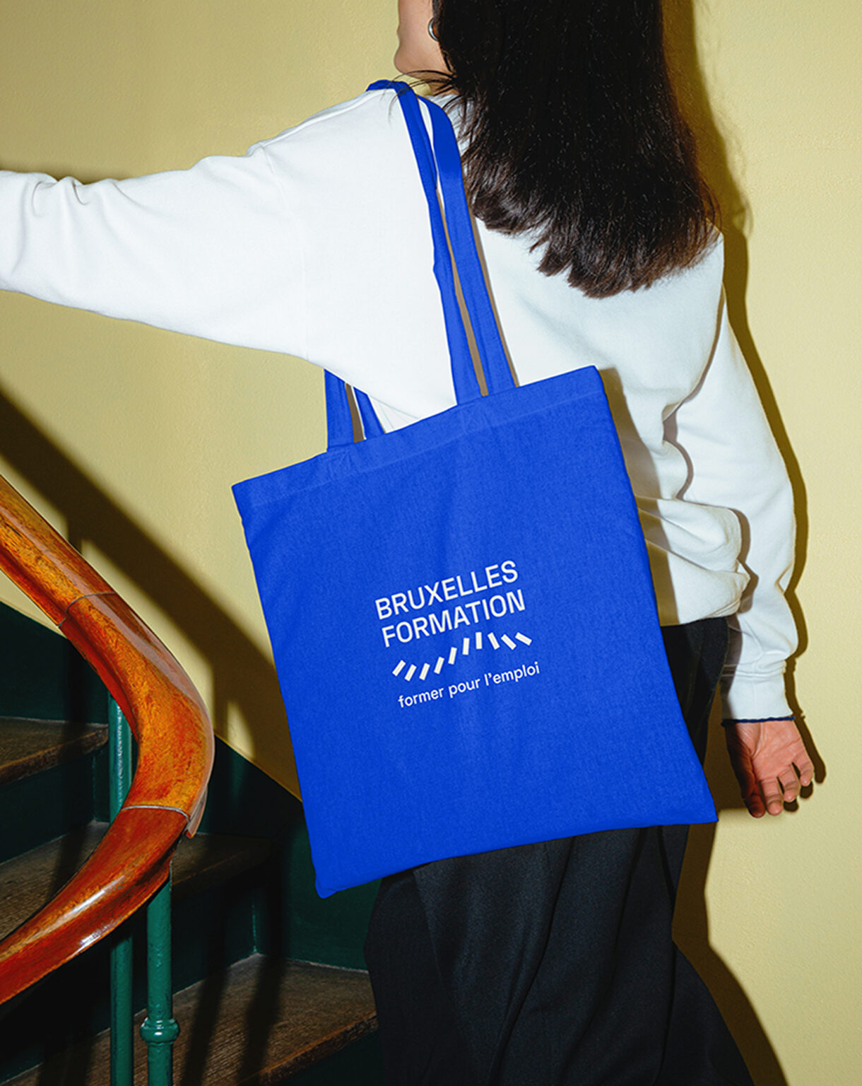
- A diversity of formats (flyers, merch such as bags, badges, brochures, etc.).
- A diversity of audiences.
Indeed, the documents that we need to design in order to improve Bruxelles Formation’s communication must:
- Be aligned with the brand across a set of various formats.
- Talk to a diversity of job seekers, who can come from different backgrounds and can have different professional goals.
Overall, the challenge is to modernise Bruxelles Formation’s image and create brand consistency across multiple formats.
Solution
Combining our strengths, Shake’s print expertise with Caracal’s graphic design skills, we have the ability to take Bruxelles Formation’s communication to the next level.
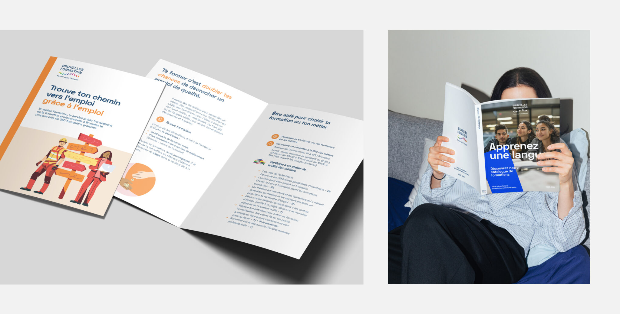
The first step, that we’ve already completed, was to take ownership of the graphic charter and to revamp it in order to create a consistent look and feel across all the printed assets.
This graphic revamp includes:
- A new brand deck,
- A set of 15 new illustrations,
- A set of 35 new icons.
The second step is now to use this updated graphic charter and apply it to all the future printed documents Bruxelles Formation will need.

Impact
Bruxelles Formation now has access to two key partners to streamline its communication and benefit from them:
- A more harmonised and consistent communication, whatever the print channel.
- An improved and refreshed brand image, enabling it to attract more jobseekers and convince employers more easily.
- Advice on which formats to use to maximise the impact of their messages and campaigns.
- The expertise to keep their graphic design and visual image up to date with the latest trends.
More to come as our collaboration continues over the coming months.
Do you also have a mobile application project?
Feel free to contact us using this form, and rest assured that we will get back to you promptly to address your needs and requests.


