A new artistic direction for a centennial automotive group
Beherman
In the life of a company, there always comes a time when it is necessary to take stock.
Whether it’s about its positioning, visual identity, or even the way it communicates with customers and competitors.
The market evolves. Customer trends and preferences change. New players emerge and challenge the status quo.
Faced with change, every company must respond and decide to adapt to the current standards of its expertise sector.
This could be in terms of:
- Visuals,
- Tone of voice,
- Technology and communication tools.
Otherwise, the risk is becoming obsolete, losing touch with its market segment, and being replaced by another player.
In collaboration with Shake, Caracal had the opportunity to offer its expertise to Beherman, assisting them on several fronts:
- Artistic direction,
- UI,
- Digital identity,
- Website design.
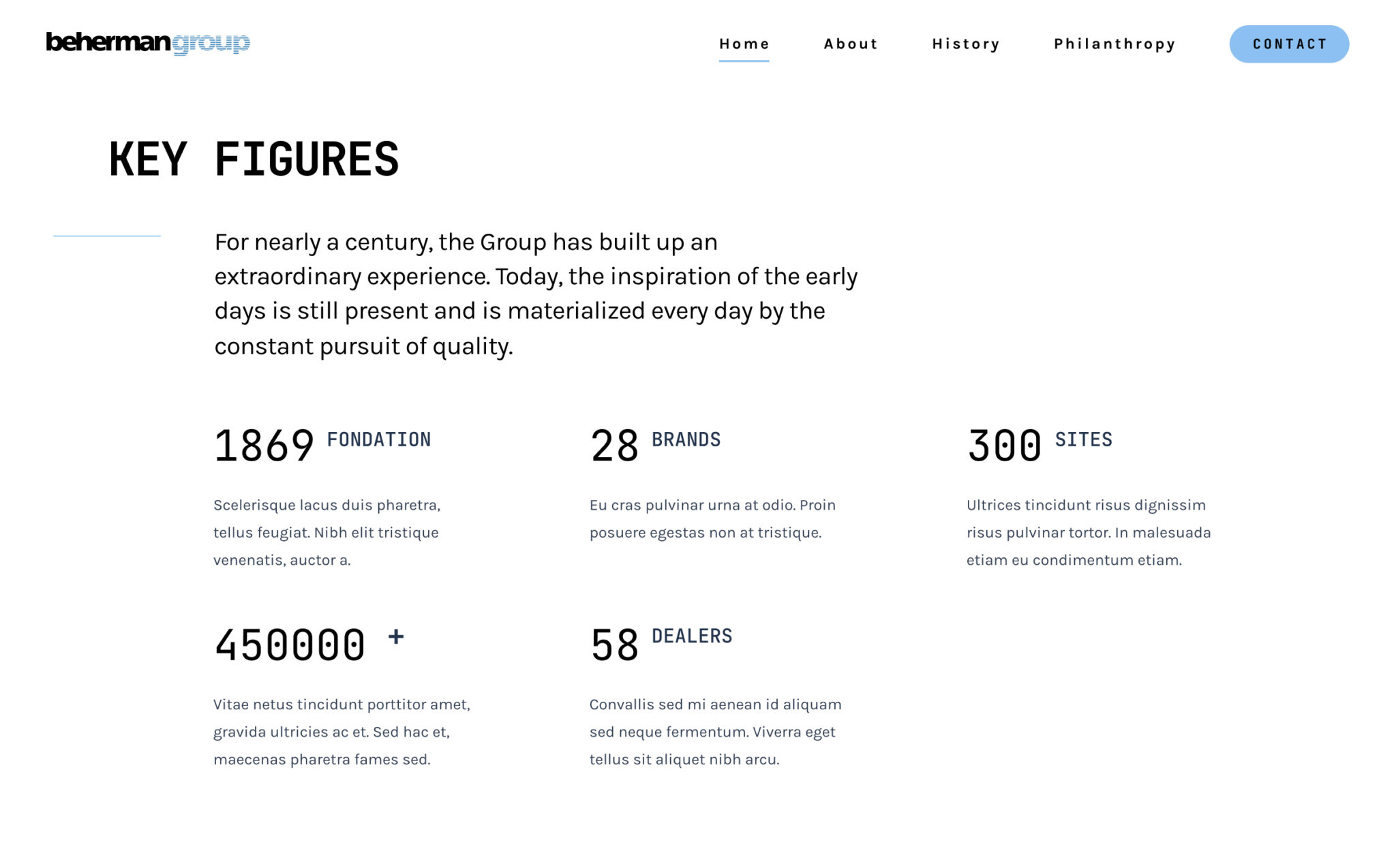
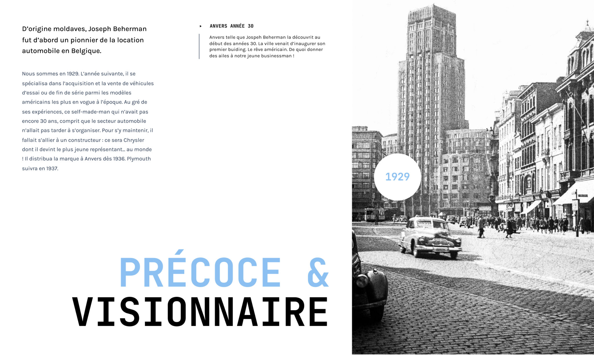
Challenges
The challenge posed by Beherman was: how to modernize a brand that has been around for nearly 100 years?
Indeed, modernizing a brand to make it align with today’s standards is not an easy task. It’s crucial to preserve the roots, values, and culture while ensuring these elements are relevant for the present and set for future years.
The challenge was to combine Beherman’s past with the present, allowing the brand to have a robust foundation for building its future.
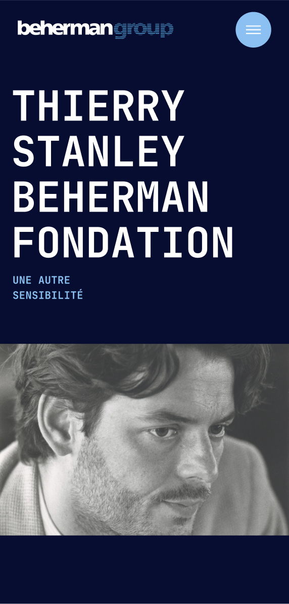
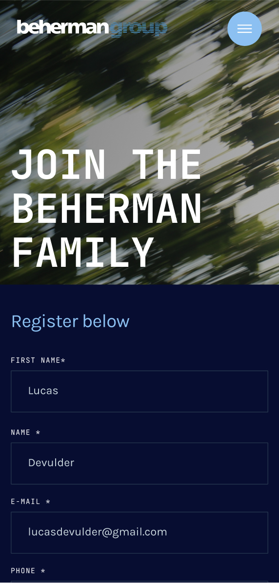
Methodology
To address this challenge, we had the opportunity to collaborate with a partner agency: Shake.
First, we took the time to understand the brand’s history. We needed to know how Beherman started, the significant milestones they achieved, and the challenges they would face in the coming years.
We also studied its values, positioning, customers, and other active players in its market.
Thirdly, we analyzed its industry, the industry’s standards, and how Beherman’s competitors positioned themselves and communicated their value proposition.
Finally, we consolidated all of this analytical work to provide a tailored solution to Beherman, allowing the brand to have a sturdy foundation upon which to build its story.
Solutions
Practically speaking, we rolled out our solution in three stages. First, we defined the artistic direction Beherman should take. Next, we used this artistic direction to establish a new digital identity:
- Colors,
- Typography,
- Tone of voice,
- Visuals.
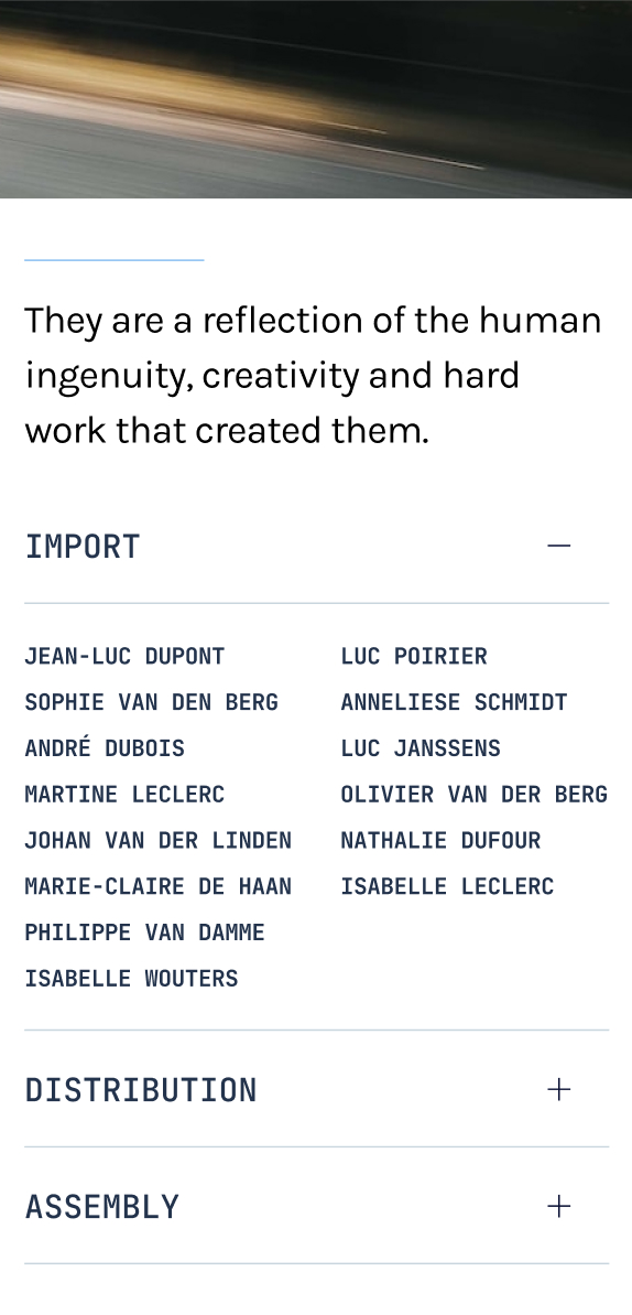
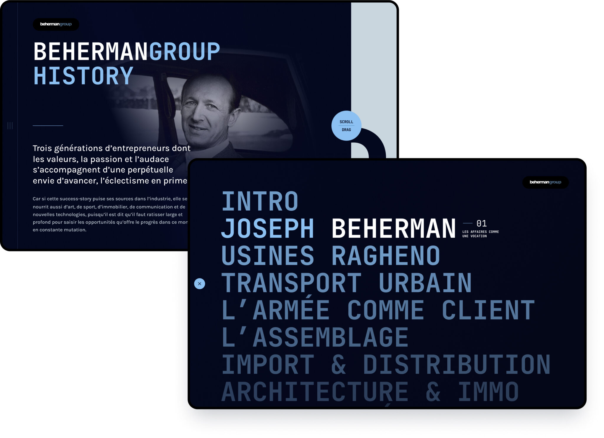
Lastly, we employed this new digital identity to redesign and modernize Beherman’s entire website. Once this design was approved, we launched it to make it accessible to the brand’s clientele.
As a bonus, we also conducted UI research to enhance the user interface and ensure smooth navigation for all users who visit the site to learn about Beherman’s services.
Impact
The impact of our supportive work manifested in several ways.
Firstly, we enabled the brand to have a fresh start and envision its future confidently, without fearing obsolescence. This essential graphic update allowed Beherman to revamp for several years, aligning with the visual codes of its industry.
Next, the development of an artistic direction and its application will enable the brand to communicate more effectively across all its channels. This direction provides clear guidelines on how it can convey its value proposition.
Thirdly, the launch of its new website will allow it to showcase and sell its services far more efficiently. A modern and functional website quickly gains user trust, a vital element for generating transactions.
Indeed, the entirety of this project represented a cost. But as explained earlier, every brand faces the same dilemma in its lifetime: to adapt to the standards of its market. This investment is necessary and easily pays off. Otherwise, a brand that doesn’t make this investment is doomed to become obsolete and surpassed by competitors.
Don’t hesitate to contact us if you’d like to audit your brand and determine if an update is needed. We’d be delighted to support you in this endeavor and help you grow your market presence.
